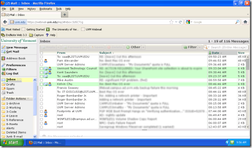
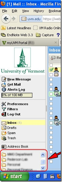
Amid the praise for and complaints about the newer version of webmail, we received a plea from a netbook user. She pointed out that the new layout made it very difficult to navigate among her mail folders. I use a netbook myself, and I thought I’d share some things that we can do to improve our browsing from a netbook. Specifically, we’re going to take webmail from this:
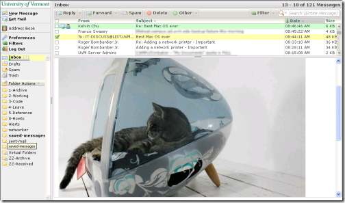
to this:
I’m using Firefox in my example because that’s the browser that the original querent was using. However, most modern browsers support similar kinds of options.
When the new webmail first was deployed, the folder list was confined to the bottom part of the sidebar. On a netbook, this was a really small area. SAA’s Scott Dellinger already has made some major improvements in the layout of the webmail window.
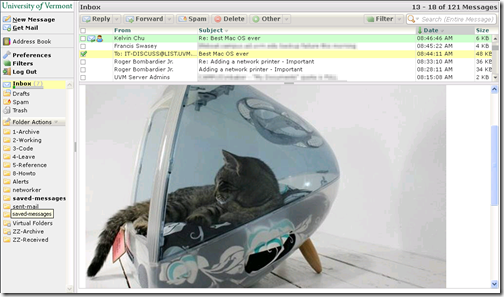
| Originally, the list of folders was confined to a small area in the sidebar. | With Scott’s improvements, there’s more room to view folders. | |
 |
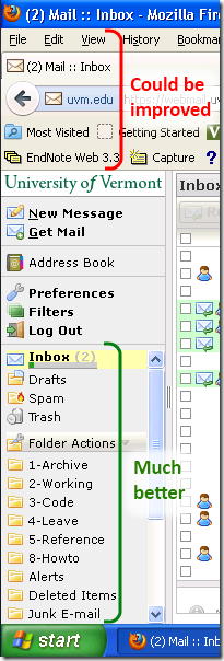 |
Even with the improved layout, there’s still a lot of the precious vertical space — usually 600 pixels — eaten up by parts of the browser that we can reclaim.
Turn off the Menu Bar and Bookmarks Toolbar
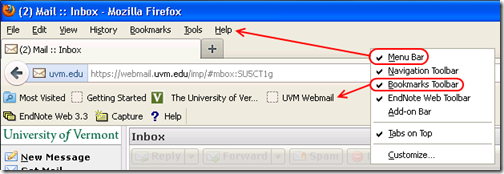
Right-click in the blank space on the menu or tool bar to get the menu below, and then click the Menu Bar and Bookmarks Toolbar items in turn.
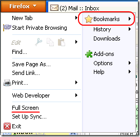
By disabling the Menu Bar, we get a Firefox menu in the upper left that gives us all the functionality we need, but tucked out of the way. Turning off the Bookmarks Toolbar turns on a small Bookmarks button. We can also access bookmarks through the Firefox menu.
Here’s what those menus look like when we click on them:
| Notice the bookmarks sub-menu… | The bookmarks menu is quicker, though. |
 |
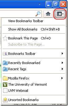 |
We now have two fewer menu bars, the tabs are sharing the title bar with the Firefox menu, and bookmarks are still a quick click away, which makes a lot more room for the content we actually want.
Here’s one more tweak to try. On the Firefox menu, there’s a Full Screen option. Select that option, or hit the F11 function key, to make the Firefox menus autohide as well.
There. Now we have all 1024 x 600 pixels devoted to webmail, or to whatever site we want to browse. We can move our cursor to the top of the screen to make Firefox show the menus and address bar. The regular keyboard shortcuts continue to function, as well (e.g., CTRL+T for a new tab). To exit Full Screen mode, we can hit F11 again or right-click on the Firefox toolbar.
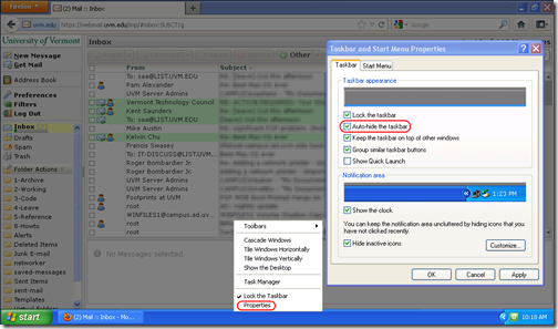
We can perform a similar tweak to Windows so that even programs without a full screen mode can use the whole screen. We’ll set the Windows taskbar to autohide, so that it only appears when we move the mouse cursor to the bottom of the screen. Just right-click on an empty portion of the taskbar and select Properties from the context menu. Next, check the option labeled Autohide the taskbar.
I hope this is helpful. Most of the options we explored above are available on other modern browsers, too. I use Windows 7 and Internet Explorer 9 on my netbook.
Whatever your choice of web browser, make the most of the space you have on your small screens.
